By now, you’ve probably heard all about it: humans are naturally wired for visual data. In fact, we process visuals 60,000 times faster than text. That means as a marketer, you’ve got to step up your game and play pretend. Pretend as if you only have a few seconds to impress your crowd. Do it and step up your visual content strategy, or lose them.
If you’d like more proof, just look at the stats from social media sites like Pinterest, Instagram, and Facebook.
Pinterest was launched in 2011 and quickly gained increase in unique visitors by 1047%. Instagram that started only a year before Pinterest has grown to 130 million users with 1 billion likes every day.
Women are more likely to respond better to pictures and men to videos. But whatever your target audience, both prefer a form of visual content if you didn’t notice.
As a business, it makes sense for you to start getting serious about funny images and memes. (Did you know how much the iconic LOLcats is worth?)
And if that’s not enough reason for you to go visual, read on for more.
5 Reasons You Should Invest in Visual Content Creation
Be remembered
Visuals are easy to remember. That means they are more “visible” too. And who in their right minds not want more visibility in the marketing jungle?
Remember how Games of Throne was advertised? A lot is possible when you bring in the visuals. . .
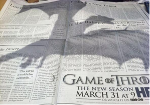
Dragon-shadow everywhere!

Source: Ad week. Game of Thrones dragon-shadow in NYT (above) and HBO building in LA
Drive more traffic
As marketers, we have to keep our finger on the pulse of what’s happening. The latest quickly becomes old in the online world.
Think infographics – a little while ago they were the “thing”.
But since so many of them are being published, more and more standard infographics are lost in the sea of visual content every day.
The solution is to stay on your toes and adapt to new changes. An infographic that got you 1000 likes last month may no longer do so.
If that’s the case, try “gifographics”. Basically, a gifographic is an animated infographic that helps you stand out from usual infographics.
As an example, check out this gifographic that got 350,000 visitors in 30 days.
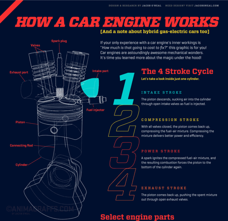
Source: Animagraffs
Another cool infographic explaining more about the Cheetah’s speed is here. The last time I checked, it had got more 1000 shares on different media combined.
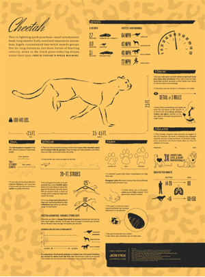
Source: Animagraffs
That doesn’t mean infographics are dead – they still yield results. But you’ve got to be pretty good at the design and do a lot more to stand out from competition.
Engage audience
Facebook is one of the leading companies in the world. Surely, their decision-making can be trusted?
Not too long ago, Facebook launched the Timeline. The impact? Brands started getting 46% more engagement per timeline post. Plus, there has been a 14% increase in fan engagement and 65% increase in interactive content engagement.
Interactive means video and images, which means visual.
Here is a table showing exact increase in different types of engagement:
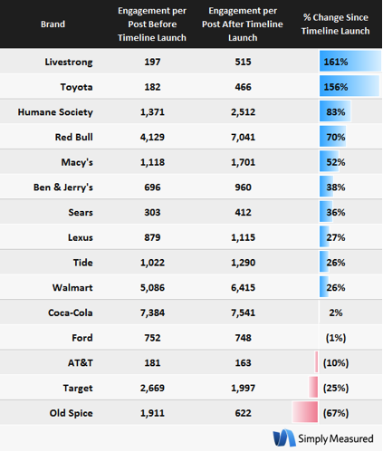
Source: Simply Measured.
Pack more information
83% of learning happens visually. In short, a majority of us are visual learners. Contrast this with people remembering only 20% of what they read every time.
Clever visual content like infographics, photos with text on them, video demos, banners etc get shared, liked and clicked more than plain text.
Big Data has made us even more restless. We’re looking for “snackable” information that’s quick and easy to understand.
We’ve got short attention spans than ever, with people taking a call on you within the first 2 to 4 seconds. That’s all you’ve got to put your best foot forward, literally.
Visual content works like a charm because visuals are appealing; they condense huge amount of data in one place and speak the universal language of pictures.
The world’s information is doubling every two years. This infographic that conveys my point in a much better and attractive manner:
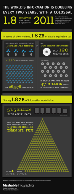
Source: Mashable.
Easy to create
It’s a no-brainer then – visual data is here to stay and thrive. People love sharing visuals because it takes much less time to digest and understand.
But if you’re wondering, “Yes but I can’t afford a graphic designer nor can I do it myself,” you’re in luck. There are innumerable tools in the marketplace to help you map out your visual content strategy.
The best part? A lot of these tools are free to use. And you don’t have to be a pro at designing either. Here are some that will help you get started are
- Visme (create whiteboard design, create HTML5 banners, infographics, animations and more)
- Awesome Screenshot (create screenshots directly inside your browser, no need to crop)
- Pixlr (loads of image editing options)
- Quozio (“make beautiful quotes”)
Payman Taei is the founder of HindSite Interactive, an award winning web design and development company that creates custom web and mobile sites and applications for businesses and organizations.