You’re an entrepreneur, a small, medium or large business or organization, and you’re wondering why your website traffic is so low or why your conversion rate is never going up. Small changes can lead to significant results, so it is possible that your website is lacking some elements that every website needs. Here are a few components essential to the success of a website.
1. Good visual design
The design of your website is one of the most important point and should never be neglected. Think about out it, it is the first thing your visitors see, it’s their first impression of your company. A poor design can quickly turn-off potential customers. I understand that exceptional design comes with a price tag, but at least make sure your website looks recent and updated. If your website looks like it has been made in Microsoft Word or stuck in the 90’, you are definitely losing potential customers. A poor design will make you look cheap, and your company’s image will suffer. Aim for the best!
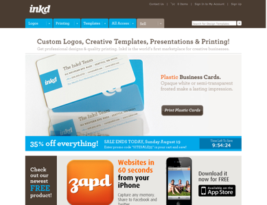
The design of Inkd website is simple; however, it looks professional, trustable and clear.
2. Calls-to-Action
No Calls to Action (CTA) = loss of sales.
A CTA is what tells a visitor what to do. Mostly seen as buttons, it is essential to drive your conversion rate. The first thing you’ll want is to think what you want your visitors to do when they visit your website. Do you want them to place an order online? Maybe to contact you for a quote or to subscribe to your newsletter? The one you choose is important, but make sure the CTA is clear.
Call to action best practices:
- Make them big. The bigger your call to action is, the most chance it will get noticed.
- Use an alternative color. Do not make them the same color as most of your website elements, remember, the point is to get your CTA noticed.
- Make them clear. Simple, short and clear, this is how call to actions should be. Always avoid jargon.
- Place them above the fold. That way, visitors will not need to scroll down to notice the CTA.
A good way to make sure your call to action is visible enough is to step back and squint your eyes, make sure your CTA still pop.
Do not forget to A/B test your calls to action often, little changes can lead to an increased conversion rate.
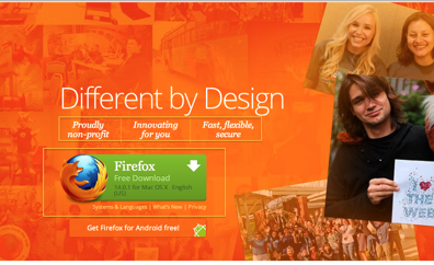
Firefox download button is a great example of a call to action. It tells user what they should expect, and why they should download.
3. A clear navigation bar
There is nothing worse than going on a website and trying to find where to go. Your primary navigation bar should always be consistent, visible and simple. It is essential to organize your links. Your navigation bar should always be the same on every page of your site.
New Zealand’s website navigation bar is a perfect example of a clear and well organized nav. bar. Important links are visible and secondary links are located in dropdown lists.
4. FAQ page
I am sure there are some questions you keep being asked. Every time, you reply the same answer over and over again, and this makes you lose some valuable time; so, how do you easily avoid that? Simple. Set up an FAQ page.
If you don’t know what an FAQ page is, it’s a page that answers frequently asked questions (that’s were “FAQ” comes from). This way, it will help you unclutter your inbox from general questions. Another advantage of having an FAQ page is that since you cannot write everything on your sales or landing pages, it gives your customer the opportunity to get a quick answer to a question they might have and quickly go back to your product or service and proceed to an order.
The first step in setting up an FAQ page is to screen your emails and make a list of frequently asked questions. After you’ve done that, answer to these questions, and voila! It’s that simple.
If you do not have any customers yet, don’t worry, think of some questions your potential customers could ask, and later as you’re getting more customers and questions, add recurring questions.
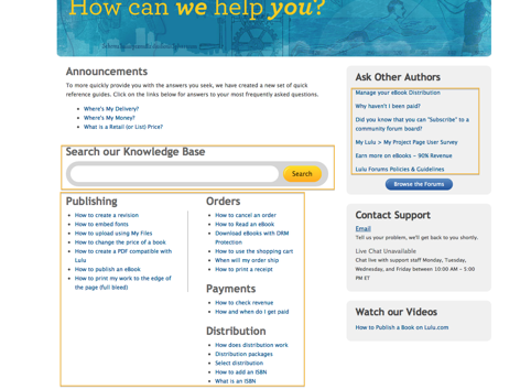
Lulu.com’s FAQ page is what your FAQ page should look like. The search function and the organized questions under visible categories are essential for visitors to quickly find what they need.
5. An effective homepage
The homepage is normally the most visited page of a site, and often the first one a visitor will see. It is crucial that your homepage clearly indicates what you do, so the customer will know what you’re about right-away. Your homepage should not contain too much text, and should give a small preview of every section of your site. Remember that your goal is to excite the visitors enough so they continue browsing your site instead of clicking the back button. It is also one of the best place to include a call to action, include short testimonials or a short explainer video. A homepage should always be kept “clean” and images and graphics should always be relevant.
Some of the best practices of homepage design:
- Set a goal. What do you want your visitors to do from your homepage?
- Keep some white space, or visitors won’t remember anything.
- Calls to action. Use them, test them.
- Keep it simple. Short headlines and a clear explanation of what you’re all about.
- Be consistent. Use the same design as your other pages. You should have a navigation bar both in the header and footer. The homepage is like the portal to the rest of your site.
- Include short testimonials, logos of clients, or media outlet who featured your business. It will give trust to visitors and will convince them to explore your site.
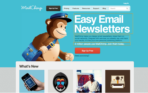
By looking a Mailchimp’s homepage, you quickly know what they do. “Easy Email Newsletters” is simple, yet very clear and describes Mailchimp well. For visitors interested in “Easy Email Newsletters”, the homepage contains a 3 line sub-header which provide a bit more information about their service. If readers are not convinced yet, the 2 million people use Mailchimp line, followed by calls to action (“Join them today”, and later, “Sign Up Free”) will surely help visitors make up their mind.
6. Your logo or name
Even if this might sound obvious, your logo or name should always be visible. When visitors click on your link in google, they need to identify where they are without any hassle and make sure they’re on the right place. It is proven that the upper left corner is the best spot for a logo. It’s always beneficial to use it as a link to take visitors back to your homepage since this is standard to most websites.
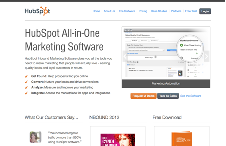
Whichever page you land on Hubspot’s website, you know you’re on Hubspot’s website. Their logo, prominently displayed in the upper left corner, tell visitors exactly where they are. Plus, if you click on it, it will take you back to the homepage.
Conclusion
In conclusion, you can see that a website is never complete. A/B tests are always necessary, and you will see that small changes can help convert visitors into customers. When you’re building a website or making changes to an existing one, always think about user experience and check if the elements explained above are present.
Raphael Paulin-Daigle is a passionate entrepreneur. He founded a couple of online stores and he recently launched a service called http://Idealinput.com, which helps businesses improve their marketing by getting feedback from marketing experts. He believes business should always be fun and positive.

