Putting the user first in effective website design has never been so important, with “page experience” set to become a Google ranking factor in March 2021. This means that every web design choice you make should always come back to the question: how does this benefit the user?
The following web design strategies are set to trend this year, but more importantly, they all put users’ needs first.
Let’s look at these strategies and how you can use them!
#1. Boost Your Website Load Speeds
People are more impatient online than they realize and don’t want to wait for a website to load. Over half of users will wait no longer than three seconds before abandoning a website!
You can measure how fast your website is loading right now by entering your URL into a free online tool such as Pingdom or Google’s PageSpeed Insights. An ideal website load time is under two seconds, but under three seconds should also be acceptable to users. If your website loads slower than this, there are a few simple steps you can take to speed things up.
First, optimize your images (if you haven’t already). Compressing images reduces the file size without affecting them visually, which in turn helps pages load faster. According to Google in 2018, 25% of pages could save more than 250KB by compressing images—you can use a free online tool such as Kraken.io.
Another way to keep users happy is to use lazy loading. In this method, the content that’s immediately visible when you land on a page loads first and very quickly. This lets users begin engaging with your site much sooner than waiting for the whole page to load first.
If you make these changes and find your website keeps loading a long time, or if it starts crashing, check you haven’t outgrown your hosting plan. If you’re exceeding your bandwidth limits, or competing with larger sites on the same server for bandwidth, upgrading could be a simple way to improve things.
#2. Get Bold With Your Font Choices
Bold fonts used properly make online copy more scannable and easier for readers to digest. Given that most website visitors only read less than a quarter of the words on a page, it’s essential that your copy is clear and easy to read quickly.
People naturally read the bigger, bolder text first, so use this to pick out key information. You should also keep text short and concise and use plenty of white space to maximize readability – bold fonts don’t work well on text-heavy pages.
#3. Structure Your Page to Create a Visual Hierarchy
What is visual hierarchy? It means structuring your webpage so that visitors instinctively understand how to use and navigate the displayed features and content, without having to actively think about it.
Most website pages naturally follow a visual hierarchy. When section title headers are displayed larger than the content, important details appear on the left, and menus sit at the top of the page – this is all part of a visual hierarchy.
Knowing what users want, you can tailor your design to prioritize their needs. For example, most users click on the logo to reach the homepage, so make your logo easy to find at all times across your site. Similarly, most of a user’s time on a website is directed towards the left side of a webpage, so put your most important content there!
You can also create a visual hierarchy by using size, space, and color.
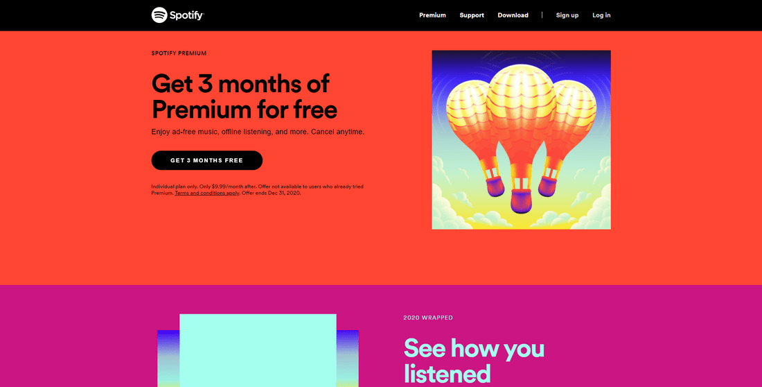
Larger, brighter elements surrounded by plenty of white space draw attention first, so you can use these to control your user’s gaze. Agencies that specialize in web design in Chicago brilliantly capitalize on this concept to make scanning and navigating your site a lot easier for the user, which in turn improves the quality of their on-site experience. Another often overlooked factor is accessibility. Building an accessible and ADA-compliant website helps make your content usable for all visitors, including those with disabilities. Partnering with website accessibility provides expert audits, guidance on WCAG standards, and actionable recommendations to remove accessibility barriers. This proactive approach not only supports a more inclusive digital environment but also reduces the risk of costly litigation and improves your site’s compatibility with assistive technologies.
#4. Personalize and Localize Your Content
Not surprisingly, most global users prefer personal experiences over generic ones, showing that consumers want greater engagement from brands. Users need to feel like individuals, not nameless, faceless visitors.
Implementing B2B website design personalization strategies can help create more tailored experiences that resonate with each visitor, enhancing engagement and satisfaction.
To meet these needs, you need to personalize your content. Using cookies is an easy way to start—they tell you when someone has already visited your site and help you tailor content. They’re especially useful for making personalized product recommendations and offering discounts to loyal customers.
Just over half of customers would like to receive offers in real-time while they’re browsing, so if you run an online store, try applying automatic discounts to shopping baskets or using popups to inform visitors of current deals.
Additionally, if you’re selling internationally, make sure you have your content translated by certified translation services and offer relevant payment methods. 72.4% of consumers are more likely to buy products in their native language, and 55% would cancel their purchase if their preferred payment method wasn’t available!
#5. Prioritize Mobile-Focused E-commerce
Forty-five percent of consumers say they’re shopping on their phones more since March 2020, so you can bet they want a smooth mobile experience. Two-thirds of users are unlikely to return to a mobile site if they struggled to access it, meaning a well-designed mobile site isn’t just good for your users – it’s also good for business!
To put your users’ needs at the heart of your mobile design, put yourself in their shoes. The first thing to do is ensure your mobile design is totally clutter-free. Prioritize the most important content, and use as much white space as you can – it helps create a clean design while also making buttons, links, and menus easier to click on.
Prioritizing User Needs Through Web Design: Summary
These six web design strategies have the power to make your website look better, rank higher, and – most importantly of all – make your users happier.
A user-first approach is possibly the best way to achieve online success in the coming year, so whether you pick one or two strategies, or make a long-term plan to adopt all six, make sure to always put your users’ needs at the heart of your design choices from now on.


