There are a variety of reasons why you would want to start a website, the most common being to get someone to read what you have to say, followed by getting someone to buy something. Before you even think about the design and layout of your site you need to define what exactly it is that you want your visitor to do when they arrive, because trust me if you don’t know that then the chances of your success are extremely slim.
When you create your website you should constantly be thinking about your call to action, examples of calls to action could be a “Buy Now” button, a “Subscribe to our Newsletter”, or even a compelling article title to “calling” the user to read your article.
In this article you’ll learn tried and tested methods of getting your website visitors to do what you want them to do (conversion), always remember though that testing is the key to getting great results, what works for one site will not work for another. Use these tactics as a starting point and then test, test, and test especially test your instincts.
Be Blatantly Obvious
It’s no secret, people on the internet have a notoriously short attention span, you only have roughly 4 seconds to convince someone to even stay on your page let alone buy something from you. It is vital that you have one clear call to action (and at most a secondary, less emphasized call to action).
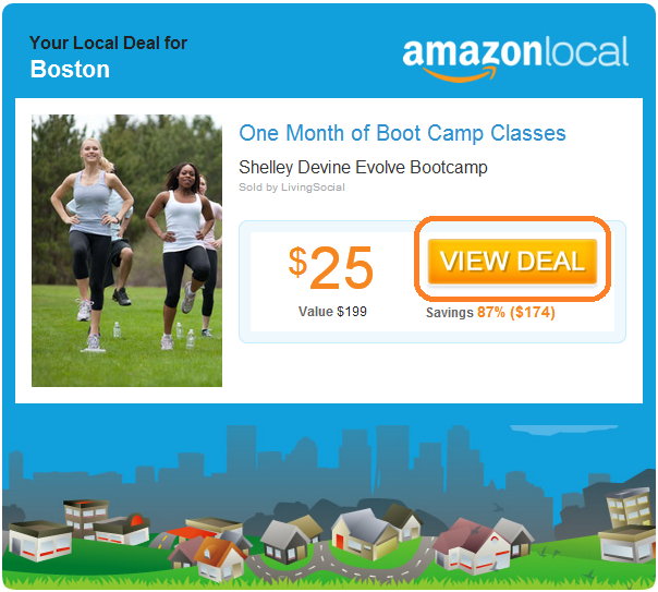
Amazon is a master of generating conversions and if you look at their recently released Amazon Local you can see their clear single call to action very easily:

Amazon uses simple and clear calls to action to guide their users to purchase, they also make good use of whitespace (negative space) to draw your attention to the call to action.
When the user first visits your site it is vital that you communicate to them what their next move should be without making them think or look for it. This covers the “How” of using your website, they should know, in under 2 seconds, what they should do and how they should do it.
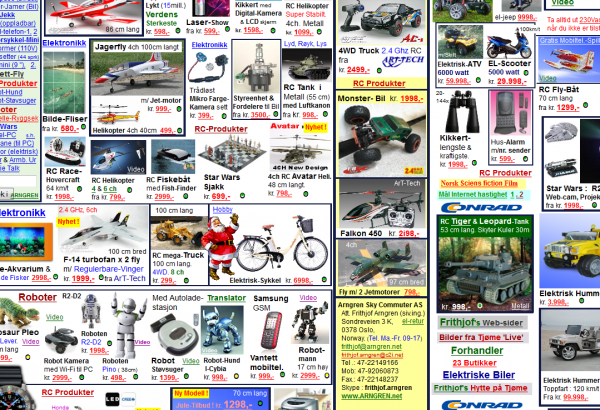
Clutter is your enemy here, make the next step for your user as clear and concise as possible.
Why should they proceed?
Once you’ve covered the “How” or the call to action you will then want to cover the “Why”, for example, when a customer gets to your site and sees that you are asking them to buy something they will immediately start to question, well why should I buy from you? Is this the best price? Will this make me happy? Do I really need this? Is this safe? etc.. Your potential customer is undoubtedly going to be asking a million questions in their head, it’s your job to satiate any concerns and make them see why your product will change their life.
First up is Social Proof, a good example of social proof is Customer Testimonials, the more non-biased you can make your Customer Testimonials appear the more your reader will trust you. Look at Amazon for example, they allow un-altered customer reviews on all of their products, because of this they have garnered a lot of trust and people order more from them because of it.
Demonstrating to your customer that there is people just like them who have ordered the product they are thinking of buying is one of the most powerful selling tools in your arsenal. And remember it doesn’t necessarily have to be a person, many sites will also show famous companies that have used their services (e.g. Disney, CNN, Google, etc..).
Here’s a list of good ways to use social proof to increase sales:
- Showing testimonials from people or businesses who have used your product or service.
- Show product ratings and how many people have purchased the item
- Facebook like box showing all the people who have liked your page
- Even showing negative testimonials helps because it increases the credibility of testimonials that are good.
Next you will want to keep the focus on them. If you look at good conversationalists (people good at meeting and talking to new people) one trait that all of them have in common is that they almost never talk about themselves, and if they ever do talk about themselves they turn the conversation back to the other person as quickly as possible. By doing this, quite ironically, they become more interesting and likeable to the person with whom they are conversing.
The same thing applies to your website visitors, when you are creating your website it is very tempting to put the focus on you with words like “me, we, I”. You need to take those words out of your internet vocabulary. When you are writing online, your visitor is always asking themselves “What’s in it for me?”. You need to keep this in mind, for example saying “You will love this product because of x benefits” is more effective then “We pride ourselves in doing our first system.” Look through your web copy and revise any section that talks about you, replace it with something that talks about them (your customer) and the benefits you can provide them.
Rule of thumb: Always focus on the benefit and what you can give to the customer and never on you or your company. Tell the customer “What’s in it for them”.
Another thing good Conversationalist’s (and Salesman) do is they quickly pick up on the language and tone of the people they are talking too. While you can’t listen to your visitors you should find out the type of language they use so that you can speak to them on their level. As an extreme example, If say you were trying to sell “Hover Boards” a scientist might technically call them “Amplified Sectional” if you were to use that technical term you will confuse your website visitors, always remember: don’t try and impress your visitors with technical mumbo jumbo, refer to things the same way your customer would.
Also remember that online people do not read large blocks of text, they scan. For landing pages you want to write for a 3rd grade reading level you do this by breaking complex ideas into bite size pieces that are easily scannable, try and limit the width of your documents to a max of 400 pixels and focus on making your text readable with good contrast. One thing that’s often overlooked is Letter spacing, a good starting point is 14px font with 150% line height (CSS line height). Also whitespace is super, super important; just because there is room for a picture of your favorite sports car does not mean that you put it their, use white space (e.g. negative space) to highlight the important parts of the site and draw your users attention to your call to action.

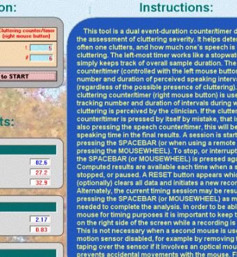
Having text bunched up together with low contrast (like the picture) will drive sales down like nothing you ever imagined.
Have a dead simple conversion process
Shopping carts a great example of breaking a lot of the guidelines i’ve talked about so far, many shopping carts have 5 pages you have to wade through, plus they force you to register for the site, when in reality in nearly every case you need only a single page for the checkout process.
Cart Ninja is a great example of a single page 1-step checkout, try out the carts demo so you can see it for yourself. Overcomplicating your cart is the best way to shoot yourself in the foot, on the cart you don’t want any distractions and you only want to ask for the minimal amount of information required. Complicating your cart will cause your visitors to give up and simply leave.
Something else to keep in mind is that if your target audience is the U.S.A. people trust and expect to be able to pay with Credit Cards, offering only Paypal is going to really limit your potential. Offering Credit Cards and Paypal side by side is a solid strategy for increasing your chances of a sale.
The same guidelines apply to any type of conversion, for example if you are collecting their email for a newsletter do you really need their phone number, physical address, and pets name? Keep it simple, keep it obvious, and get results.
Testing
Like I mentioned at the beginning of this article, testing is vital to your success. The guidelines I mentioned are just that, guidelines, they aren’t rules set in stone. Start with stuff that works and the use your gut instinct to start testing. Use split testing software like Google Website Optimizer or Optimizely.com to test various aspects of your site to see what generates more sales and conversions.
Here are a couple of things to test:
- Headers (try and help people scan your site better)
- Call To Action Wording (e.g. Buy Now, Try Now, Download Now, Continue, Sign Up, etc..)
- Call To Action Button Color (Good colors to test between is red and green)
- Change up various blocks of wording
- If you see a competitor or other site trying something new, split test it.
- Always remember your goals when you test, if a test doesn’t generate more sales throw it away for something that does (irregardless of what you might think)
Small tests can make a huge difference in your bottom line.
Conclusion
The internet is a fast paced world where people will only give you a few seconds of their time unless you convince them otherwise, by following the guidelines in this article you will be well on your way to getting the results you want.
About the writer: Jordan is the founder of Cart Ninja an easy to use shopping cart optimized for making it dead simple for your customer to buy things from you.


