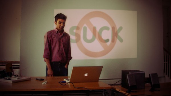
I don’t particularly like PowerPoint. I have to admit, I almost laughed the first time someone asked me to send them my “deck”. PowerPoint presentations can be boring, confusing, distracting, lazy, inappropriate…I’m sure you know where I’m coming from.
Think about you feelings toward PowerPoint. They’re probably similar to mine. Most PowerPoint presentations are beyond useless. They actively detract from what you are trying to say. In fact, Amazon has banned PowerPoint entirely from all meetings, and even the Army is trying to move away from it.
But PowerPoint is a tool. Like a hammer. And like all tools, there is a best way to use it, and many bad ways to use it. Here are a few tips to help people remember your idea.
- Your PowerPoint presentation should augment your idea. It should not BE your idea. If you are going to fully write out every idea on a slide, you might as well write a report. People should not be focused on your slides anyway, they should be focused on you.
- Therefore, no slide should have more than 10 words on in. There are very few exceptions to this rule. People should be focusing on your presentation, not the slides. The slides are support, and should be providing emotion more than detail.
- Start off by telling a story. Stories grab attention. Even better is to create a mystery. So rather than starting with your end conclusions, start with the questions, and then answer them. People will have more fun following along. This works in all cases. Remember, you are giving a presentation. Engage your audience, and make them interested.
- When the ideas get complicated, use pictorial representations of the ideas. Pictures are a thousand words, but can be read instantly. These could be bar or line graphs, ven diagrams, simple sketches, and more. This takes practice but be creative. Pictures should be about concepts and emotions, not detail. An excellent reference is Dan Roam’s Back of the Napkin. And if you want to see an example of a fantastic slide presentation, check out Dan’s summary of the 2009 health care legislation.
- Make a separate document for “take away”. The qualities of a good take-away document and a good PowerPoint are non-overlapping. If your presentation and report are the same thing, your audience will be daydreaming about what to get on their pizza that night. (See #1 above.) Your slides should be brief, visual, and augmenting. Your takeaway document should be descriptive and complete. Never create slides thinking that “I’ll just email everyone my slides as notes.”
Got more ideas? Let’s hear them in the comments.
Marc Brodeur just wants everyone to be awesome. His first company, Brode, the first professional drinking companion, makes a special vitamin that helps promote proper hydration and detox when drinking alcohol.


